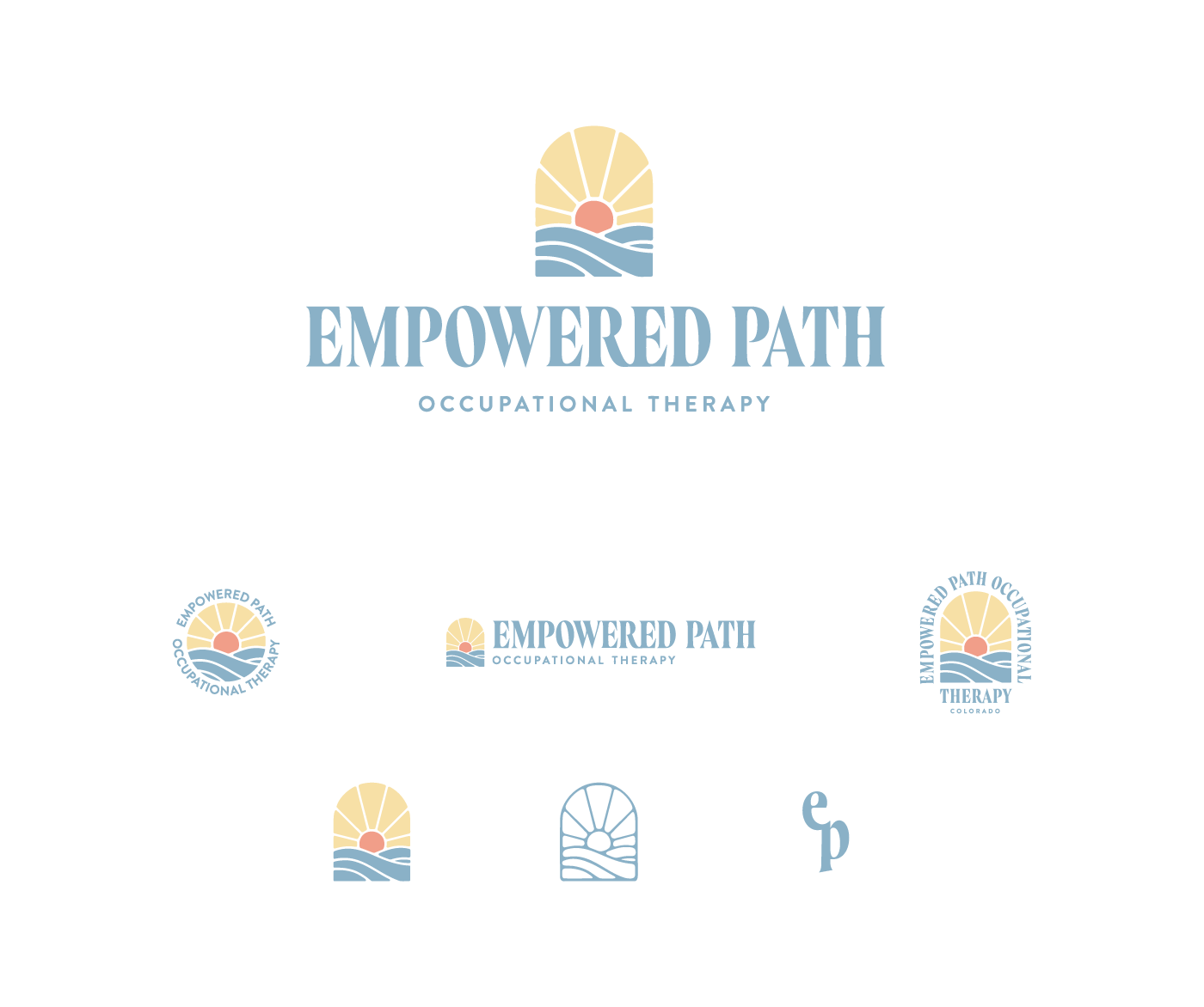
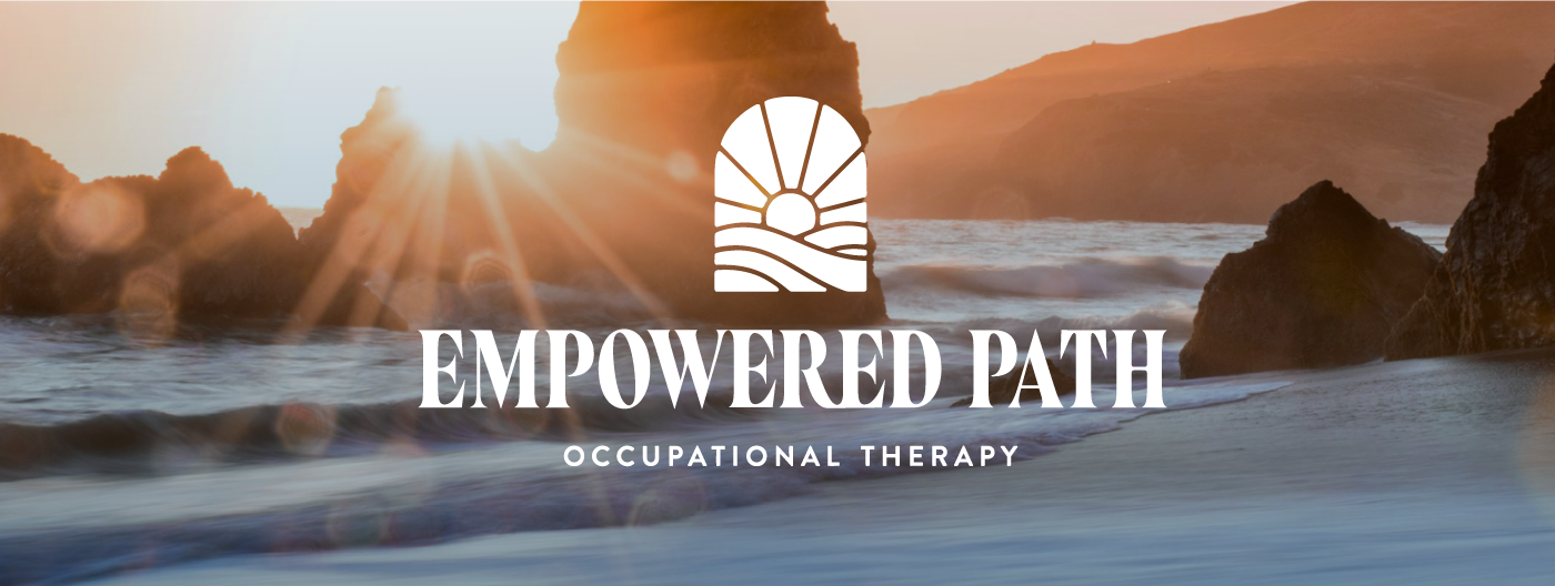
Visual identity and website for Empowered Path Occupational Therapy, based in Colorado. The goal was to develop a brand that felt warm, radiant, and inviting. The owner, Katy, was also interested in incorporating water elements, inspired by her previous career in the Coast Guard.
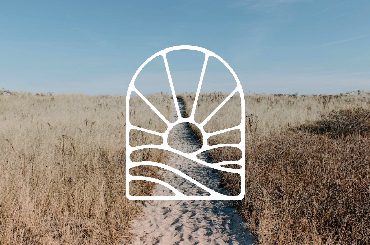
The final design features a sunrise icon over waves, symbolizing warmth, growth, and new beginnings—a journey towards healing. This is paired with bold typography to capture the "Empowered" concept. The color palette includes dusky blue, peach, and sunny yellow, along with a palette of complementary colors to tie everything together. The identity is flexible with different variations for layout and sizing, providing Katy with a versatile library of assets for her marketing and social media needs.
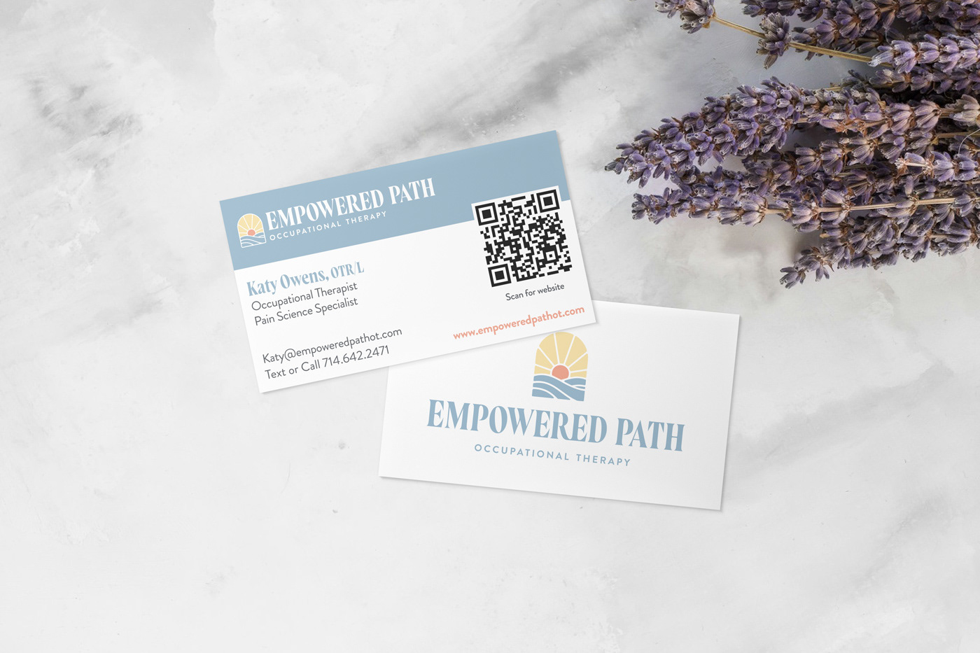
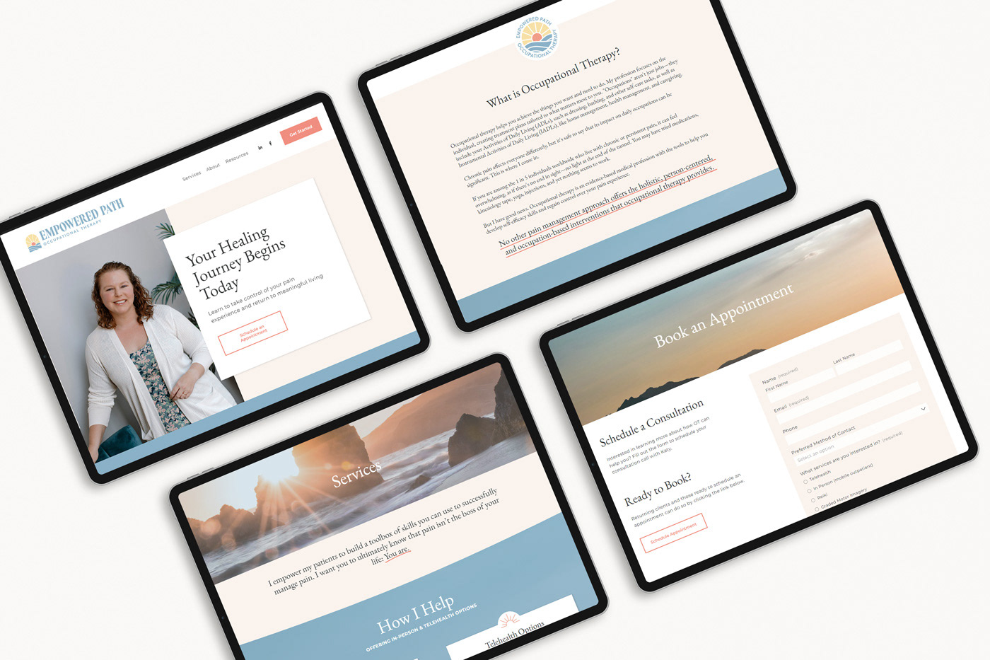
In addition to the logo and variations, I designed business cards and a website, using the Squarespace platform. The site introduces visitors and potential clients to Katy, explains her approach, offers helpful resources, and makes it easy for clients to schedule appointments.